Time Log Teams – time spent on other Teams’ sites (must have 3 entries or more):
Date: Mar. 14, 2025 From: 03:20pm To: 03:35pm
Date: Mar. 14, 2025 From: 03:36pm To: 03:46pm
Date: Mar. 14, 2025 From: 11:12pm To: 11:20pm
Date: Mar. 14, 2025 From: 11:21pm To: 11:29pm
Time Log – time spent on other students’ sites (must have 4 entries or more):
Date: Mar. 14, 2025 From: 03:50pm To: 03:55pm
Date: Mar. 14, 2025 From: 04:00pm To: 04:07pm
Date: Mar. 14, 2025 From: 11:34pm To: 11:42pm
Date: Mar. 14, 2025 From: 11:43pm To: 11:48pm
Essay I. Summary of your activities in your contents including new contents created (one paragraph). Provide all the hyperlinks (clickable) of new contents you have created this week.
This week, I created two posts. One introduces orgin of saying god bless when others sneeze. The other why you wake up before the alarm go off. Below are the hyperlinks to the new content I created this week:
The Strange Reason You Wake Up Right Before Your Alarm Goes Off
The Chilling Truth About Why We Say “Bless You” When Someone Sneezes
Essay II. Summary of your KPI table (add screenshots or table) (one paragraph excluding the KIP table)
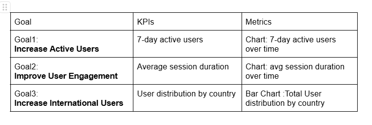
The KPI table for this week focuses on tracking key website performance indicators, including user engagement, 7-day active users, and international reach. The first goal is to increase active users, measured by the number of 7-day active users. The second goal aims to improve user engagement, using average session duration. Lastly, the fourth goal focuses on increasing interantional reach, analyzing user distribution by countries.
Essay III. Summary of your Looker Studio Report with your KPI identified (add screenshots) (one paragraph)
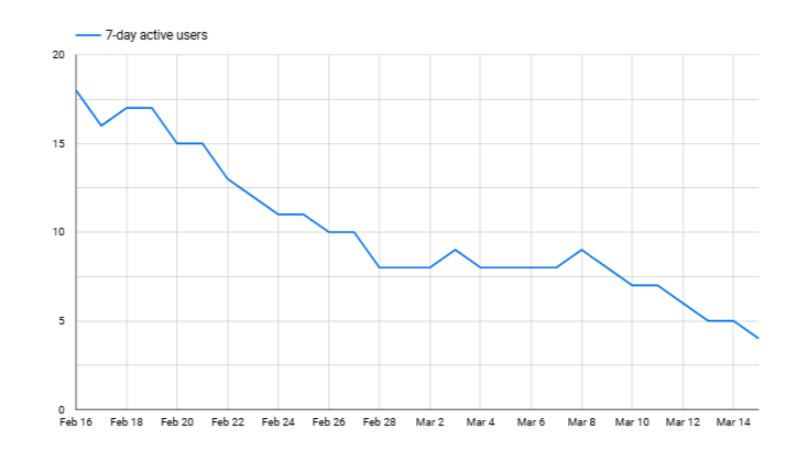
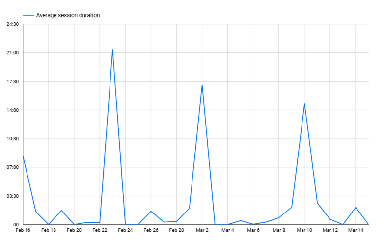
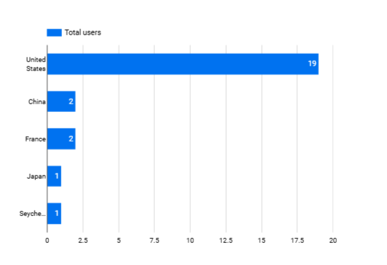
The Looker Studio report provides a detailed evaluation of website performance, aligning with the established KPIs to track user activity, engagement levels, and geographic reach. The 7-day active users chart exhibits a declining trend, indicating a gradual drop in user retention over time. The average session duration chart presents irregular fluctuations, with certain days experiencing significant spikes, suggesting periods of heightened interaction or potential data anomalies. The user distribution bar chart emphasizes a strong concentration of users in the United States, with minimal representation from other countries, underscoring the need for a broader international reach. These insights are essential for assessing user behavior and refining strategies to enhance engagement, retain active users, and expand the global audience.